
The size of the mobile screen defines user experience. Larger the screen better the experience. However, it is hard to come across full touchscreen mobile phones with zero hard buttons and almost all the functions shifted to touchpad.
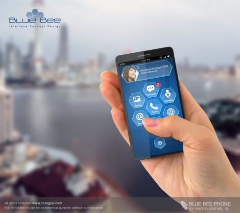
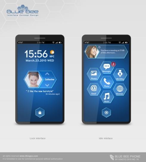
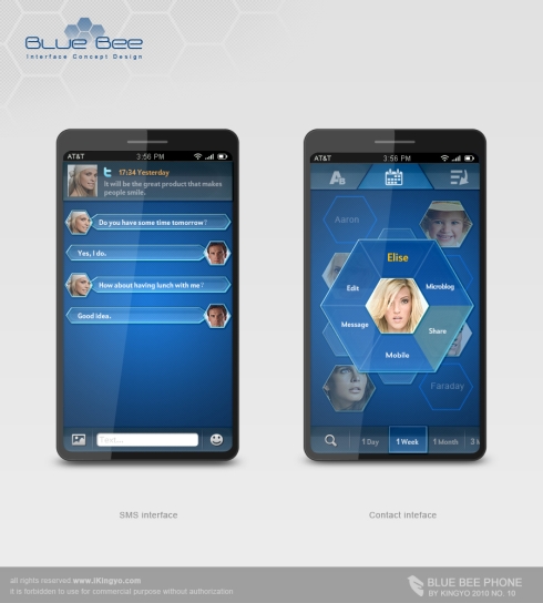
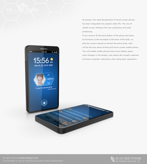
The "Blue Bee" is very slim smartphone concept at design get very interesting handset interface. Which, you can see, the UI looks a bit like the Windows Mobile 6.5 interface and it requires a large touchscreen to operate and there’s no need for any physical button, at all
An interesting idea is placing a touchpad at the back of the phone's body; touchpad would extend the display to almost the entire body of the handset and provide more screen space and means of interaction. The touch panel on the side behind is operable as shown in the last image included in the article.
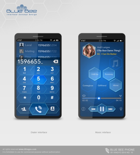
It's very easy to operate and it'll allow moving in menus, reaching the Home menu and selecting content. Overall, the dialer, music interface and much of the UI looks very neat and user-friendly
Designer: Kingyo




0 Comment:
Post a Comment